Unemployment has been a long-standing issue for Italy. According to Eurostat, in December 2019 Italy has one of the highest unemployment rates in the Euro Area (9.8%), preceded only by Spain (13.7%) and Greece (16.6%). The Italian Youth Unemployment rate (people aged between 15-24) in 2018 was a staggering 32.2%, denoting a wide structural problem in the Italian economy. Many studies has been published on the topic, and it is still one of the hottest issues in the country. Every political party argues that Unemployment is a pivotal point in their political agenda and different governments tried to propose and implement their solutions.
In case you want to dig deeper into the numbers, an old post of mine analyses Italian Unemployment using data from ISTAT (The Italian National Institute of Statistics). The post includes geographical segmentations of Unemployment, time-series analyses and much more, so please feel free to check it out by clicking on this link.
Scope of the project
The idea to pursue this project came to me quite randomly. While I was analysing data on Italian Unemployment, I was also completing a Machine Learning course by fast.ai, and I thought that Unemployment could be a brilliant topic on which I could some of the techniques that I was learning. In particular, I could have used socialdemographic data to predict if a person is either Unemployed or Employed. Indeed, this is the ideal case for a binary classification problem: given the available data on one individual, can we predict if he/she is employed or not? If we can train a model with a good accuracy, we can also investigate which specific variables of our dataset produce an increase in the risk of Unemployment. We will come back to this point later in this post.
The main data source for this project is the ‘Italian Labour Force Survey’, the main source of statistical information on the Labour market, conducted by ISTAT (The Italian National Institute of Statistics). The data is publicly available and is provided by Unidata
Exploratory Data Analysis
#import the needed modules
import pandas as pd
from pathlib import Path
import os
from fastai import *
from fastai.tabular import *
import pyreadstat
import matplotlib.pyplot as plt
import seaborn as sns
import scipy.stats as ss
from sklearn.preprocessing import LabelEncoder
from sklearn.metrics import classification_report
from xgboost import XGBClassifier
from sklearn.metrics import confusion_matrix
from sklearn.metrics import accuracy_score
from sklearn.model_selection import cross_val_score
#we define the path in which our dataset is contained
data_path = Path('data')
The Labour Surveys are conducted each quarter. I have downloaded data from July 2017 to October 2018 (the last available survey) in order to have a large number of individuals surveyed. Weirdly, the format of the Surveys is .sav, we therefore use pyreadstat in order to read the data. We also concatenate the frames to have one, unique dataset.
df1, meta1 = pyreadstat.read_sav(os.path.join(data_path,'Survey_2018Oct.sav' ))
df2, meta2 = pyreadstat.read_sav(os.path.join(data_path,'Survey_2018Jul.sav' ))
df3, meta3 = pyreadstat.read_sav(os.path.join(data_path,'Survey_2018Apr.sav' ))
df4, meta3 = pyreadstat.read_sav(os.path.join(data_path,'Survey_2018Jan.sav' ))
df5, meta3 = pyreadstat.read_sav(os.path.join(data_path,'Survey_2017Oct.sav' ))
df6, meta3 = pyreadstat.read_sav(os.path.join(data_path,'Survey_2017Jul.sav' ))
frames = [df1, df2, df3, df4, df5, df6]
df = pd.concat(frames, sort = False)
by calling df.shape we can see that our dataset records information of 560,961 individuals.
df.shape
(560961, 366)
The features are encoded with a title that reflects the type of question being posed during the questionnaire. To understand the dataset better, we extracted the variables’ descriptions and we can create a dictionary ‘dict[variable] = description’. Unluckily, the variables’ descriptions are in Italian.
#load the file containing the description of the variables
variables_df = pd.read_csv(os.path.join(data_path, 'Survey_variable-description.csv'), encoding='latin-1', sep=";")
variable_dict = {}
for v, d in zip(variables_df['Variable'], variables_df['Description']):
  variable_dict[v] = d
def variable_descr(variable):
  try:
    return variable_dict[variable]
  except KeyError:
    return 'variable is not listed'
#print an example
variable_descr('EDULEV')
'titolo di studio a 6 modalità di fatto una riaggregazione della SG24'
Unique Values
let’s count the number of unique values for each variable.
#make a copy of the dataset
data = df.copy()
#set seaborn style and palette
sns.set_style("whitegrid")
sns.set_palette("husl")
plt.figure(figsize=(35, 10))
data_features = [col for col in data.columns[6:] if col not in ['MFRFAM', 'MFRIND']]
uniques = [len(data[col].unique()) for col in data_features]
ax = sns.barplot(data_features, uniques, log=False)
ax.set(xlabel='Feature', ylabel='unique count', title='Number of unique values per feature')
for p, uniq in zip(ax.patches, uniques):
    height = p.get_height()
    ax.text(p.get_x()+p.get_width()/2.,
            height + 3,
            uniq,
            ha="center", fontsize=12)

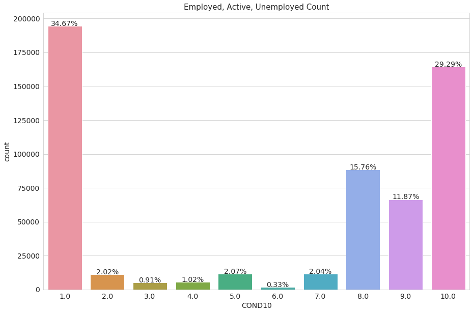
The dataset also contains a variable with the Employment condition of the surveyed, divided into ten sections. The categories are encoded with numbers, we display a dataframe to explain what these categories mean.
plt.rcParams.update({'font.size': 14})
total = len(data)
plt.figure(figsize=(15,10))
ax = sns.countplot(x="COND10", data=data)
plt.title("Employed, Active, Unemployed Count",fontsize=15)

for p in ax.patches:
    height = p.get_height()
    ax.text(p.get_x()+p.get_width()/2.,
            height + 10,
            '{:1.2f}%'.format(height/total*100),
            ha="center", fontsize = 14)

plt.show()
COND10_df = pd.read_csv(os.path.join(data_path, 'COND10-description.csv'), sep= ';')
| ID | DESCR | |
|---|---|---|
| 0 | 1 | occupati |
| 1 | 2 | persone in cerca- con precedenti esperienze- e... |
| 2 | 3 | persone in cerca- con precedenti esperienze- e... |
| 3 | 4 | persone in cerca- senza precedenti esperienze |
| 4 | 5 | inattivi in età lav.- cercano non attivamente ... |
| 5 | 6 | inattivi in età lav.- cercano ma non disponibili |
| 6 | 7 | inattivi in età lav.- non cercano ma disponibili |
| 7 | 8 | inattivi in età lav.- non cercano e non dispon... |
| 8 | 9 | inattivi in età non lav.- meno di 15 anni |
| 9 | 10 | inattivi in età non lav.- più di 64 anni |
Ctaegories 9 and 10 represents surveyed people that are unemployed but are either too young or too old to work (-15 years old or +64 years old), we are not intereseted in predicting for these categories
df = df[df.COND10 != 9.0]
df = df[df.COND10 != 10.0]
data = df.copy()
df.shape
(330019, 53)
The dependent variable: COND3
We want to predict if an individual is either employed or unemployed, the feature ‘COND3’ perfectly encodes this concept. It divides people into three categories: Employed (1), Active(2) or Unemployed(3)
plt.rcParams.update({'font.size': 14})
total = len(data)
plt.figure(figsize=(15,10))
ax = sns.countplot(x="COND3", data=data)
plt.title("Employed, Active, Unemployed Count",fontsize=15)

for p in ax.patches:
    height = p.get_height()
    ax.text(p.get_x()+p.get_width()/2.,
            height + 10,
            '{:1.2f}%'.format(height/total*100),
            ha="center", fontsize = 14)

plt.show()
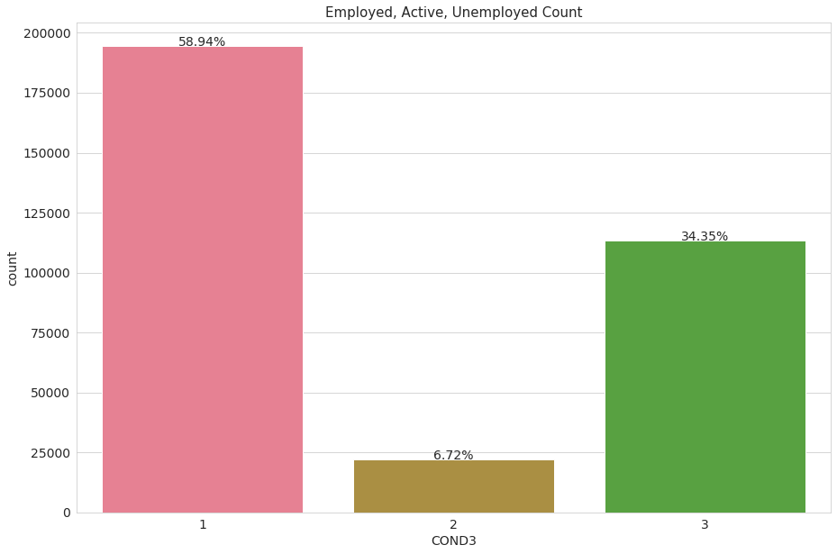
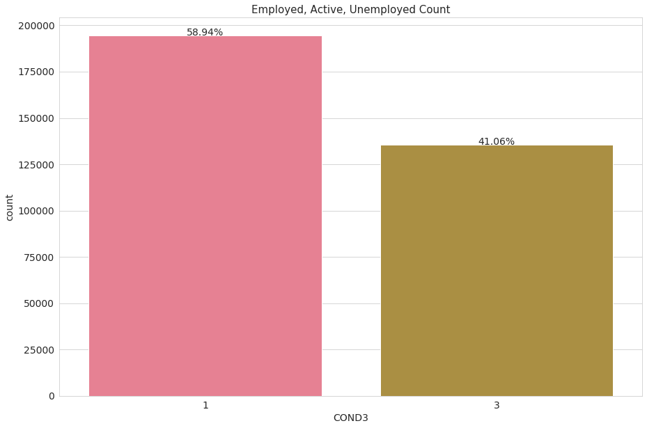
The label class 2 (actively looking for a job) is really unbalanced (only 3% of the observations), for convenience we will turn it into class label 3, unemployed. Again, we are predicting for employment/unemployment only.
df.loc[df['COND3'] == int(2), 'COND3'] = int(3)
data = df.copy()
#plot the same graph, after the transformation
plt.rcParams.update({'font.size': 14})
total = len(data)
plt.figure(figsize=(15,10))
ax = sns.countplot(x="COND3", data=data)
plt.title("Employed, Active, Unemployed Count",fontsize=15)

for p in ax.patches:
    height = p.get_height()
    ax.text(p.get_x()+p.get_width()/2.,
            height + 10,
            '{:1.2f}%'.format(height/total*100),
            ha="center", fontsize = 14)

plt.show()
Geographical info
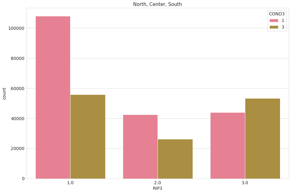
We are interested in observing how many people individuals were sampled from each geographical area. Also, we want to understand howv Employed and unemployed people are distributed geographically. The variable ‘RIP3’ divides people into 3 geographical groups (North - 1, Center - 2, South - 3)
total = len(data)
plt.figure(figsize=(15,10))
ax = sns.countplot(x="RIP3", data=data)
plt.title("North, Center, South",fontsize=15)

for p in ax.patches:
    height = p.get_height()
    ax.text(p.get_x()+p.get_width()/2.,
            height + 10,
            '{:1.2f}%'.format(height/total*100),
            ha="center", fontsize = 14)

plt.show()
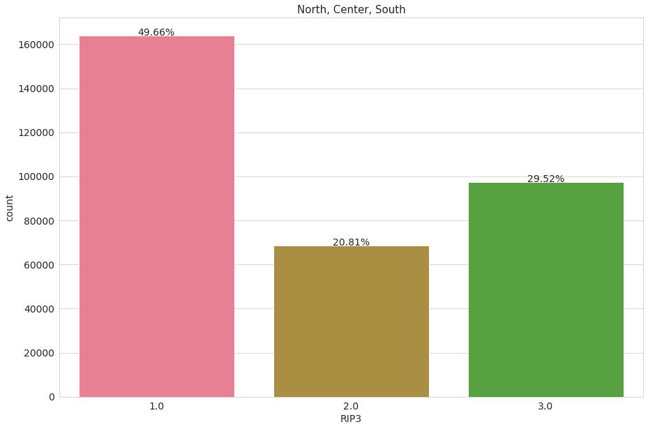
Let’s now mix it up with employment features. We immediately observe that in the South of Italy there are more unemployed people than employed ones.
total = len(data)
plt.figure(figsize=(15,10))
ax = sns.countplot(x="RIP3", data=data, hue="COND3")
plt.title("North, Center, South",fontsize=15)

plt.show()
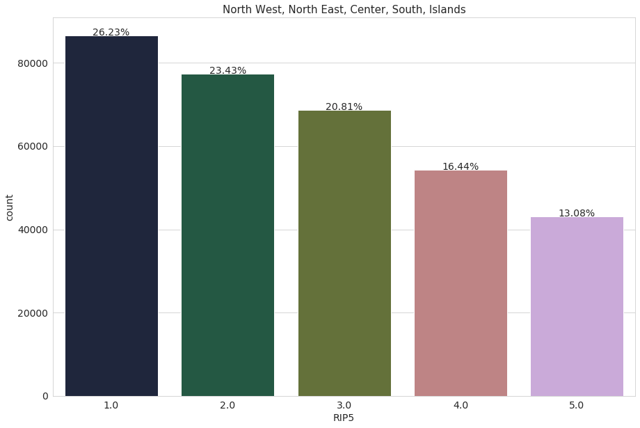
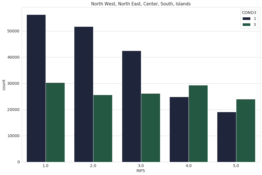
We repeat the same process, this time with the variable ‘RIP5’. The variable ‘RIP5’ divides people into 5 geographical groups: North West - 1, North East - 2, Center - 3, South - 4, Islands - 5
sns.set_palette("cubehelix")
total = len(data)
plt.figure(figsize=(15,10))
ax = sns.countplot(x="RIP5", data=data)
plt.title("North West, North East, Center, South, Islands",fontsize=15)

for p in ax.patches:
    height = p.get_height()
    ax.text(p.get_x()+p.get_width()/2.,
            height + 10,
            '{:1.2f}%'.format(height/total*100),
            ha="center", fontsize = 14)

plt.show()
total = len(data)
plt.figure(figsize=(15,10))
ax = sns.countplot(x="RIP5", data=data, hue="COND3")
plt.title("North West, North East, Center, South, Islands",fontsize=15)
plt.show()
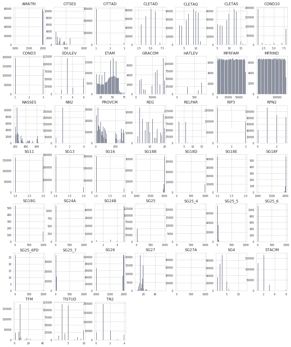
Other features distribution
Let’s now plot the distribution of all the other interesting features
plt.rcParams.update({'font.size': 10})
df_filter = data[data.columns[8:]]
df_filter.hist(figsize=(16, 20), bins=50, xlabelsize=8, ylabelsize=8);
Model Training
After perfrorming a small bit of feature engineering on the dataset that I am not going to show in this blog post (for length reasons), let’s actually train a model.
#let's load the feature engineered dataset
df = pd.read_csv(data_path/'Survey_f.csv')
#create train and test df
msk = np.random.rand(len(df)) < 0.9
train_df = df[msk]
test_df = df[~msk]
len(train_df), len(test_df)
(302982, 33913)
It is extremely useful to identify and assign categorical and numerical variables. We want to predict for Unemployment/Employment, the dependent variable (the one that that we want our model to predict for) is therefore ‘COND3’. We plotted this variable in the previous section of the post.
#assign variables to total, continuos, catgorical and dependent categories
tot_vars = list(train_df.columns)
cont_vars = ['Population_T', 'Population_F', 'Population_M']
dep_var = 'COND3'
cat_vars = list(set(tot_vars) - set(cont_vars) - set(dep_var))
The dataset contains a lot of NA values, we want to identify the columns with the most missing values. The code below does exactly so.
na_series = train_df.isna().sum()
na_df = pd.DataFrame({"NA" : na_series})
na_df.loc[na_df['NA'] != 0].sort_values(by = ['NA'], ascending = False)[:10]
From fast.ai forum, this is the best practice for NA values “In general you can do this. For the case of a numeric variable you can add a new column X1_is_NA which is going to be 1 if the original X1 column was NA and 0 otherwise. Then you substitute the NA value in the original column with the mean/ median. For a categorical variable you can leave NA as a new category.”
features = train_df.isnull().any()
features_na = features[features==True]
features_na = list(features_na.index)
for g in features_na:
  df[g + '_is_NA'] = train_df[g].apply(lambda x: 1 if np.isnan(x) else 0) #create a new column _is_NA
being categorical variables, we leave NA as a new category (in this case NA = 9999)
train_df.fillna(9999, inplace = True)
The Dataset is now ready for training and testing. However, in order to pass the dataset to sklearn we still need to split our training test in training and validation sets, we leave our test set untouched. The function train_test_split() from sklearn makes this passage super easy.
train_df.replace({'COND3': {1: 0}}, inplace = True)
train_df.replace({'COND3': {3: 1}}, inplace = True)
/usr/local/lib/python3.6/dist-packages/pandas/core/generic.py:6702: SettingWithCopyWarning:
A value is trying to be set on a copy of a slice from a DataFrame.
Try using .loc[row_indexer,col_indexer] = value instead

See the caveats in the documentation: http://pandas.pydata.org/pandas-docs/stable/user_guide/indexing.html#returning-a-view-versus-a-copy
  regex=regex,
from sklearn.model_selection import train_test_split
X_train, X_test, y_train, y_test = train_test_split(train_df[cat_vars+cont_vars], train_df[dep_var], test_size=0.33)
The number of features in the dataset is not super-high, therefore using Deep Learning techniques like Neural Network is not beneficial in terms of performance. Neural Networks also lack in terms of explainability. We therefore employ 3 models from the Sklearn library:
- XGBoost
- Random Forest Classifier (RFC)
- K Nearest Neighbors (lgbm)
The Sklearn library makes it super easy to fit these models with our dataset. We are going to fit each model and print the results. We are going to compare the results with the following metrics: f1-score, accuracy, precision, recall
len(X_train), len(X_test), len(y_train), len(y_test)
(202997, 99985, 202997, 99985)
XGBoost
# fit model to training data
XGB = XGBClassifier()
XGB.fit(X_train, y_train)

# make predictions for test data
y_pred = XGB.predict(X_test)

#classification report
XGB_classr = classification_report(y_pred,y_test)
XGB_classr_dict = classification_report(y_pred,y_test, output_dict=True)
print(XGB_classr)

#confusion matrix
XGB_cm = confusion_matrix(y_pred,y_test)
print(XGB_cm)

#Accuracy Score
XGB_acc = accuracy_score(y_pred,y_test)
print("Accuracy: %.2f%%" % (XGB_acc * 100.0))
              precision    recall  f1-score   support

           0       0.85      0.78      0.82     64855
           1       0.65      0.76      0.70     35130

    accuracy                           0.77     99985
   macro avg       0.75      0.77      0.76     99985
weighted avg       0.78      0.77      0.77     99985

[[50581 14274]
 [ 8580 26550]]
Accuracy: 77.14%
LIGHTGBM
pip install lightgbm
Requirement already satisfied: lightgbm in /usr/local/lib/python3.6/dist-packages (2.2.3)
Requirement already satisfied: numpy in /usr/local/lib/python3.6/dist-packages (from lightgbm) (1.17.5)
Requirement already satisfied: scipy in /usr/local/lib/python3.6/dist-packages (from lightgbm) (1.4.1)
Requirement already satisfied: scikit-learn in /usr/local/lib/python3.6/dist-packages (from lightgbm) (0.22.1)
Requirement already satisfied: joblib>=0.11 in /usr/local/lib/python3.6/dist-packages (from scikit-learn->lightgbm) (0.14.1)
import lightgbm
# fit model to training data
lgbm = lightgbm.LGBMClassifier()
lgbm.fit(X_train, y_train)

# make predictions for test data
y_pred = lgbm.predict(X_test)

#classification report
lgbm_classr = classification_report(y_pred,y_test)
lgbm_classr_dict = classification_report(y_pred,y_test, output_dict=True)
print(lgbm_classr)

#confusion matrix
lgbm_cm = confusion_matrix(y_pred,y_test)
print(lgbm_cm)

#Accuracy Score
lgbm_acc = accuracy_score(y_pred,y_test)
print("Accuracy: %.2f%%" % (lgbm_acc * 100.0))
              precision    recall  f1-score   support

           0       0.85      0.79      0.82     63887
           1       0.67      0.76      0.72     36098

    accuracy                           0.78     99985
   macro avg       0.76      0.78      0.77     99985
weighted avg       0.79      0.78      0.78     99985

[[50569 13318]
 [ 8592 27506]]
Accuracy: 78.09%
Random Forest Classifier
from sklearn.ensemble import RandomForestClassifier
rfc = RandomForestClassifier(n_estimators=100)
rfc.fit(X_train, y_train)

# make predictions for test data
y_pred = rfc.predict(X_test)

#classification report
rfc_classr = classification_report(y_pred,y_test)
rfc_classr_dict = classification_report(y_pred,y_test, output_dict=True)
print(rfc_classr)

#confusion matrix
rfc_cm = confusion_matrix(y_pred,y_test)
print(rfc_cm)

#Accuracy Score
rfc_acc = accuracy_score(y_pred,y_test)
print("Accuracy: %.2f%%" % (rfc_acc * 100.0))
              precision    recall  f1-score   support

           0       0.87      0.83      0.85     62284
           1       0.74      0.80      0.77     37701

    accuracy                           0.82     99985
   macro avg       0.81      0.82      0.81     99985
weighted avg       0.82      0.82      0.82     99985

[[51699 10585]
 [ 7462 30239]]
Accuracy: 81.95%
let’s compare the results between different models
results = pd.DataFrame({
    'Model': [ 'XGBoost','lgbm', 'Random Forest'],
    'accuracy': [XGB_acc, lgbm_acc, rfc_acc],
    'precision': [XGB_classr_dict['weighted avg']['precision'], lgbm_classr_dict['weighted avg']['precision'], rfc_classr_dict['weighted avg']['precision']],
    'recall': [XGB_classr_dict['weighted avg']['recall'], lgbm_classr_dict['weighted avg']['recall'], rfc_classr_dict['weighted avg']['recall']],
    'f1-score': [XGB_classr_dict['weighted avg']['f1-score'], lgbm_classr_dict['weighted avg']['f1-score'], rfc_classr_dict['weighted avg']['f1-score']]})

result_df = results.sort_values(by='accuracy', ascending=False)
result_df = result_df.set_index('Model')
result_df
| accuracy | precision | recall | f1-score | |
|---|---|---|---|---|
| Model | ||||
| Random Forest | 0.819503 | 0.823662 | 0.819503 | 0.820771 |
| lgbm | 0.780867 | 0.789422 | 0.780867 | 0.783391 |
| XGBoost | 0.771426 | 0.783078 | 0.771426 | 0.774746 |
Model Interpretation
Sophisticated ML models are notoriously difficult to explain. While their implementation are usually straight-forward, they often lack the feature of interpretability. This is a fundamental issue in Machine Learning, as many practitioners train and deploy models without understanding what’s going on under the hood, treating them as ‘black boxes’. SHAP, a game theoretic approach to explain the output of any machine learning model, are a great solution to this problem.
Now that we have our models, we will procede to interpret them; given it’s manifested superiority in prediction accuracy, we are going to explain the output of our RFC model. I will show you how SHAP values can accurately explain this model and increase its explainability. This post also include Python code in case you wanted to follow these steps in your projects. This Medium Article from Dataman explains the concept of SHAP and Shapley values beautifully
pip install shap
import shap
shap.initjs()
# explain the model's predictions using SHAP values
# (same syntax works for LightGBM, CatBoost, and scikit-learn models)
random_pick = np.random.choice(len(X_train), size=100)
S = X_train.iloc[random_pick, :]
explainer = shap.TreeExplainer(lgbm, model_output='margin', feature_perturbation='interventional', data=S)

shap_values = explainer.shap_values(S)
print(shap_values[0].shape)
# visualize the first prediction's explanation (use matplotlib=True to avoid Javascript)
shap.force_plot(explainer.expected_value, shap_values[10, :], S.iloc[10, :])
(68,)
Have you run `initjs()` in this notebook? If this notebook was from another user you must also trust this notebook (File -> Trust notebook). If you are viewing this notebook on github the Javascript has been stripped for security. If you are using JupyterLab this error is because a JupyterLab extension has not yet been written.
The force_plot() function is really interesting, let’s explain it!
The output value is the prediction for that observation (the prediction of the tenth row in Table S is 4.28).
base_value = lgbm.predict(S, raw_score=True)
base_value[10].round(2)
4.28
The base value: The original paper explains that the base value E(y_pred) is “the value that would be predicted if we did not know any features for the current output.” In other words, it is the mean prediction, or mean(y_pred) of the S table.
y_pred = lgbm.predict(S, raw_score=True)
y_pred.mean().round(3)
-0.478
Red/blue: Features that push the prediction higher from the base_value (to the right) are shown in red, and those pushing the prediction lower are in blue. Red features increase the risk of Unemployment, Blue ones decrease it. For example, ETAM=16 is the age of the individual: the model recognized that youth unemploment is a big problem in Italy and therefore predicts higher risk for a 16 years-old individual.
Now let’s imagine that we can transpose each row of the S table after passing it into force_plot(). This is exactly what the graph below plots.
shap.initjs()
shap.force_plot(explainer.expected_value, shap_values, S)
Have you run `initjs()` in this notebook? If this notebook was from another user you must also trust this notebook (File -> Trust notebook). If you are viewing this notebook on github the Javascript has been stripped for security. If you are using JupyterLab this error is because a JupyterLab extension has not yet been written.
If we hover on the graph we can see the individual features that pushed the prediction higher/lower
shap.initjs()
shap.summary_plot(shap_values, S)
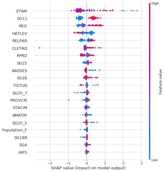
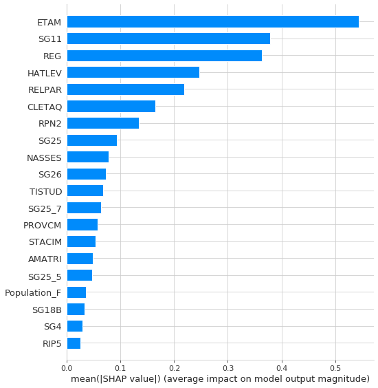
Let’s finally plot the overall feature importance (for table S)
shap.summary_plot(shap_values, S, plot_type="bar")
